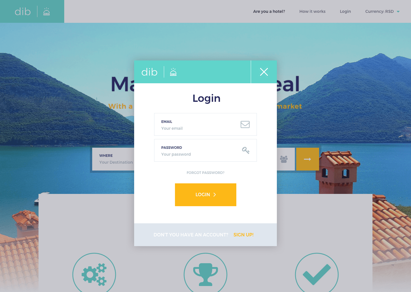
Redesign
DIB Hotel
Tired of paying too much for hotel stays? DIB Hotel lets you set your own price to ensure you get an unbeatable deal.
Introduction
🎯 The challenge
The challenge was to redesign the whole website, create the new style guide and everything had to be responsive for mobile devices and improve the user experience of the payment process.
👨🏻‍💻 Responsibilities
My responsibilities were to create the style guide from scratch, creating a fully clickable prototype, improve the user experience, prepared all the assets for the developers and project maintenance.
Wireframing
Wireframing process
The first step was to wireframe some possible solutions and test it how they are working. I worked closely with the stakeholders, and I worked interactively and quickly with them.

I started to define the right layouts and to understand better the flow of the product. I created a low-definition prototype and check how it works.
Web ui DEsign
Homepage and Login page
After a lot of wireframes and prototypes done, I spent around two weeks to define with the stakeholders the final high-definition interface of the products, and we did a lot of research and tests to have the final designs done and ready for development.
Bid price
The goal was to create a functional design and easy to use for the users, so when they are trying to get the best hotel's offers around the location defined they can do it with just 3-4 clicks. The second challenge to keep in mind was that every single component needs to be responsive to mobile devices.
Payment method
I spent a lot of time on researches to see how the competitors are working in the payment field, what's their process, what are the payment methods they are using. The interaction is also crucial to the users; the feedback that they will receive at the end of the process is essential.
Responsive UI DEsign
Responsive Mobile
I spent around one week to create everything responsive to various mobile devices. I did a lot of tests with the stakeholders, and I tried to get as much as I can stakeholder's feedback and improve all until the best solution.
With the full prototype, we tested the experience of the product on the responsive devices.
Style guide
Style guide definition
The style guide was the first step at the beginning of the project that I started to define. I examined all the material that I had from the old-style guide.

I began to improve all the elements, I followed the Human-centred design, and I added all in Zeplin for the whole development team. So they have everything in place ready to develop the final product.
Thanks for watching!
Go on top
GET IN TOUCH.
DribbbleLinkedinhello@markoperic.ch
© 2016–2019 Marko Perić. Made in Webflow with 💜